
Blog Post
From Entities to Enterprise Risk: Kovrr's Portfolio Analysis
May 5, 2026
TL;DR
- Large enterprises, PE firms, and global conglomerates manage cyber risk across multiple entities, each with its own distinct exposure profile and technology environment.
- Producing an accurate measure of portfolio-wide cyber exposure requires accounting for correlation between entities, as shared dependencies influence how losses materialize at the group level.
- Kovrr's Portfolio Analysis gives risk managers a dedicated workspace to group entities and model aggregated cyber exposure across the entire portfolio.
- The results dashboard surfaces key metrics, loss distributions, entity-level breakdowns, and risk drivers, giving organizations a comprehensive view of where portfolio exposure originates.
- Risk managers can drill into event frequency, attack vectors, top technologies, and event distribution to understand the underlying factors shaping portfolio-wide cyber exposure.
The Challenge of Managing Cyber Risk Across Multiple Entities

Global enterprises, private equity firms, conglomerates, and other large-scale organizations may share a corporate umbrella, but the entities operating beneath it are far from uniform. Each functions with a distinct technology stack, industry context, and regulatory environment, which inherently means each carries a distinct cyber exposure. Understanding cyber risk at that higher organizational level, therefore, requires more than individual entity modeling. The aggregate picture, how cyber exposure compounds and concentrates across the portfolio as a whole, demands a level of analysis that goes much deeper.
That aggregate assessment has historically been difficult to produce, primarily because cyber risk does not neatly add up the way balance sheet figures do. Two entities facing similar threats do not merely double the exposure when combined. Shared dependencies and overlapping attack vectors, among other factors, all influence how losses materialize at the group level. Producing an accurate measure of portfolio-wide exposure demands a methodology that accounts for those relationships.
Comparison adds a separate layer of difficulty. Risk managers who have already quantified individual entities with CRQ know the value of that data, but translating it into something actionable across a portfolio requires holding multiple analyses in mind simultaneously, without a unified framework to support them. Kovrr's Portfolio Analysis feature was designed precisely for that purpose, giving risk managers a dedicated workspace to group entities, model their aggregated exposure, and understand how cyber risk distributes and compounds across the organizations they oversee.
Creating a Portfolio Group

The Portfolio Analysis feature builds on work that has already been done. Before grouping entities, each one must first be modeled individually within Kovrr's platform, a process that involves building out the organization's Cyber-Sphere, defining its assets, security controls, and firmographic characteristics, and running a quantification to produce outputs such as Average Annual Loss and Annual Event Likelihood. Once that groundwork is in place, Portfolio Analysis takes the next step.
Creating a group is then a straightforward, three-step workflow. Users first assign a group name, then select a minimum of two entities to include, and lastly set a correlation value that reflects how losses across those entities are expected to interact. All entities within a group must share the same currency, ensuring that the aggregated exposure figures are financially coherent. Once configured, running the analysis produces a complete portfolio-level view of how cyber risk aggregates across the selected entities.
Understanding Aggregated Cyber Risk Across the Portfolio

Once a portfolio group has been configured and the analysis has been run, the results dashboard provides a comprehensive view of how cyber risk materializes across the selected entities as a whole. The dashboard aggregates those individual risk profiles into a unified picture, accounting for the correlation between entities and surfacing the factors that drive the group's overall exposure. Every component is designed to shed light on a different dimension of the portfolio's overall exposure.
Top-Line Portfolio Exposure Metrics

The first thing a user sees upon entering the results dashboard is the Risk Evaluation section, which surfaces the three boardroom-ready cyber metrics that define the portfolio's aggregated exposure. The Average Annual Loss represents the expected financial impact across all next-year simulations for the group as a whole. The 1:100 Annual Loss reflects the loss figure that has a 1% likelihood of being exceeded, offering a view into the more extreme end of the portfolio's risk spectrum.
The third tile displays the entities included in the group alongside the correlation setting applied, giving users an immediate reminder of the parameters that shaped the analysis. As a set, these three metrics offer stakeholders a financially grounded and quantified starting point for understanding portfolio-wide cyber risk before diving into the more granular components of the dashboard below.
Loss Exceedance Probability

The Exceedance Probability chart, also known as a loss exceedance curve, visualizes the portfolio's full loss distribution, plotting the relationship between potential loss amounts and the probability of those losses being exceeded in a given year. Instead of reducing exposure to a single figure, such as a score, the curve gives risk managers a continuous view of how loss likelihood changes across the entire range of possible outcomes, from expected losses to the more extreme tail events that sit well beyond the 1:100 threshold.
While the Annual Exposure view reflects aggregate loss probability across the portfolio as a whole, the Occurrence Curve isolates individual event probabilities, offering a more granular perspective on how catastrophic scenarios might materialize. For organizations managing risk across multiple entities, this distinction is particularly valuable, allowing risk managers to understand not just what the portfolio's average exposure looks like, but how severe losses could realistically become under the most adverse conditions.
Entity Risk Capital

The Entity Risk Capital section breaks down the portfolio's aggregated exposure by individual entity, displaying each one's AAL, 1:100 Annual Loss, and risk contribution as a percentage of the total. This view helps organizations understand which entities are driving the most exposure within the group. The toggle between Risk Capital and Breakdown views gives users additional flexibility in how to interpret and present those figures.
Annual Frequency by Event Type

The Risk Drivers section gets more granular, examining the underlying factors shaping the portfolio's risk profile. The Annual Frequency by Event Type chart shows how often different event types are expected to occur across the group. Users can toggle individual entities on and off, making it possible to compare frequency profiles across the portfolio and discover where specific event types are most concentrated.
MITRE ATT&CK Vectors

The MITRE ATT&CK framework is a globally recognized knowledge base of adversary tactics and techniques, widely used by security teams to understand and categorize how cyber attacks unfold. The MITRE ATT&CK Vectors chart surfaces the top initial access vectors driving exposure across the portfolio, ranked by AAL. Understanding which attack vectors are contributing most to the portfolio's modeled financial exposure allows organizations to move from a general awareness of risk to a more targeted mitigation approach.
Technologies and Services
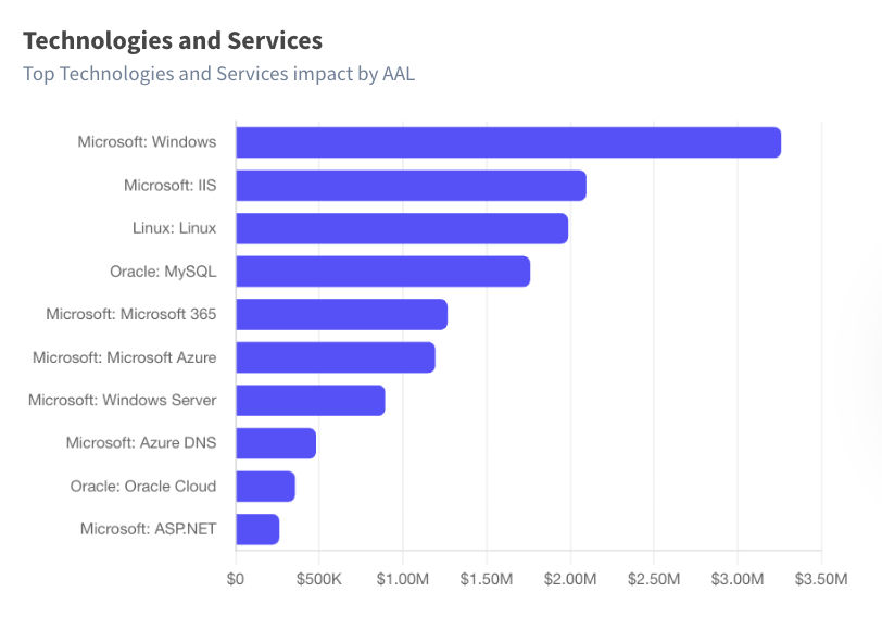
The Technologies and Services visualization identifies the top technologies and services contributing to portfolio-wide exposure, ranked by AAL. Where the MITRE ATT&CK Vectors chart points to how attackers are getting in, this one points to what they are getting in through. Shared technologies across entities can quietly compound exposure in ways that entity-level modeling alone would never surface. This view is where that dynamic becomes visible.
Event Summary

The Event Summary table presents a group-level breakdown of frequency and loss percentiles by event type, covering the portfolio as a whole rather than individual entities. For each event type, users can see how often it is expected to occur, what the average annual loss associated with it is, and how losses distribute across the 50th and 95th percentiles.
It's worth noting that the frequency figures across event types have not been added together directly. Certain events affect multiple entities simultaneously, meaning the same incident can be reflected across more than one event type. The table accounts for this complexity, producing figures that accurately reflect how losses materialize at the group level rather than treating each entity's exposure as entirely independent.
Event Distribution
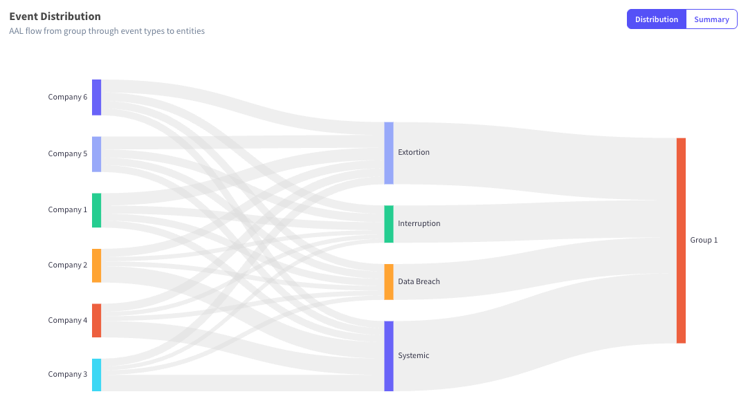
The Event Distribution diagram maps the flow of AAL from individual entities through event types to the portfolio total. The visual makes it apparent how each entity contributes to the potential average annual financial impact of each event type, and how those contributions converge into the group's overall exposure figure. Concentrations that might otherwise be difficult to detect in a more traditional table format become immediately legible here.
Managing Cyber Risk at the Portfolio Level
Individual entity quantification outputs can answer a lot of business-critical questions. However, many of the ones that come directly from leadership tend to require a different vantage point. For private equity firms, global conglomerates, and large enterprises in particular, that point is the portfolio level. Learning how exposure accumulates across entities and which underlying factors are driving it most is what allows organizations at that scale to make informed, defensible decisions.
Kovrr's Portfolio Analysis was designed to provide that higher-level perspective, combining the individual pieces of an organization's cyber risk picture into a single, coherent view. By grouping entities, accounting for the correlation between them, and surfacing aggregated exposure across every dimension of the results dashboard, the feature equips risk managers with a level of visibility that individual entity modeling alone cannot provide.
If you oversee cyber risk across multiple entities and are looking for a more structured way to understand your aggregate exposure, schedule a demo with one of Kovrr's cyber risk experts today.
.webp)

.jpg)

.jpg)