
Blog Post
7 Things People Get Wrong About Quantifying Cyber Risk
August 15, 2026
Most explanations of financial cyber risk modeling cover what it is. The more useful material is what surprises people once they have a model in front of them, because several of the outputs run against intuition and get misread in predictable ways.
Seven of those are worth knowing before the first results arrive. None requires a statistics background, and each one changes how a number should be read or reported.
1. The Output Is a Distribution, Not a Figure
The most common misreading treats an expected annual loss as a prediction. It is the average of many simulated years, most of which look nothing like the average.
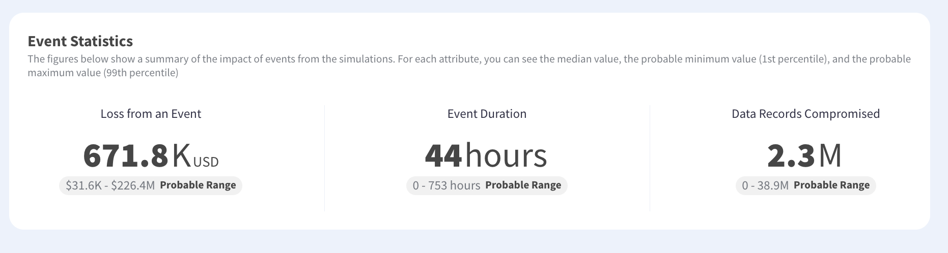
A median event cost in the high hundreds of thousands can sit inside a simulated range running from tens of thousands to hundreds of millions. Quoting the median without the range invites a false precision that collapses the first time an actual incident lands somewhere else on the curve. Reading the exceedance curve is what turns that spread into something usable rather than something to apologize for.
The practical rule is one figure per decision. Expected annual loss belongs in budgeting because it annualizes cleanly. A one-in-one-hundred-year figure belongs in insurance and continuity conversations because that is the event a program exists to survive. Presenting only the first makes a severe tail look acceptable, and presenting only the second makes routine years look catastrophic.
2. Stronger Security Does Not Mean Lower Exposure
Run a model across several business units and the correlation between security maturity and modeled loss is frequently weak or inverted. The entity with the better control posture often carries the larger figure.
Nothing is wrong with the model. Exposure scales with what an organization has to lose, so a well-defended division holding substantial revenue, sensitive records and critical dependencies outranks a poorly defended one with little at stake. Treating a high figure as a criticism of the security team is the error, and it is the reason comparing investment against actual risk needs both numbers rather than either alone.
The fix is comparing like with like. Control effectiveness expressed as the share of baseline exposure a program removes lets two units be compared fairly, while absolute exposure compares the size of what they protect. Reporting both side by side stops a large division being penalized for being large, which is the conversation that otherwise consumes the first review meeting.
3. Most of the Achievable Reduction May Already Be Captured
A current exposure figure invites the assumption that better controls could remove most of it. Modeling the floor answers that directly, and the answer is often uncomfortable for a business case.
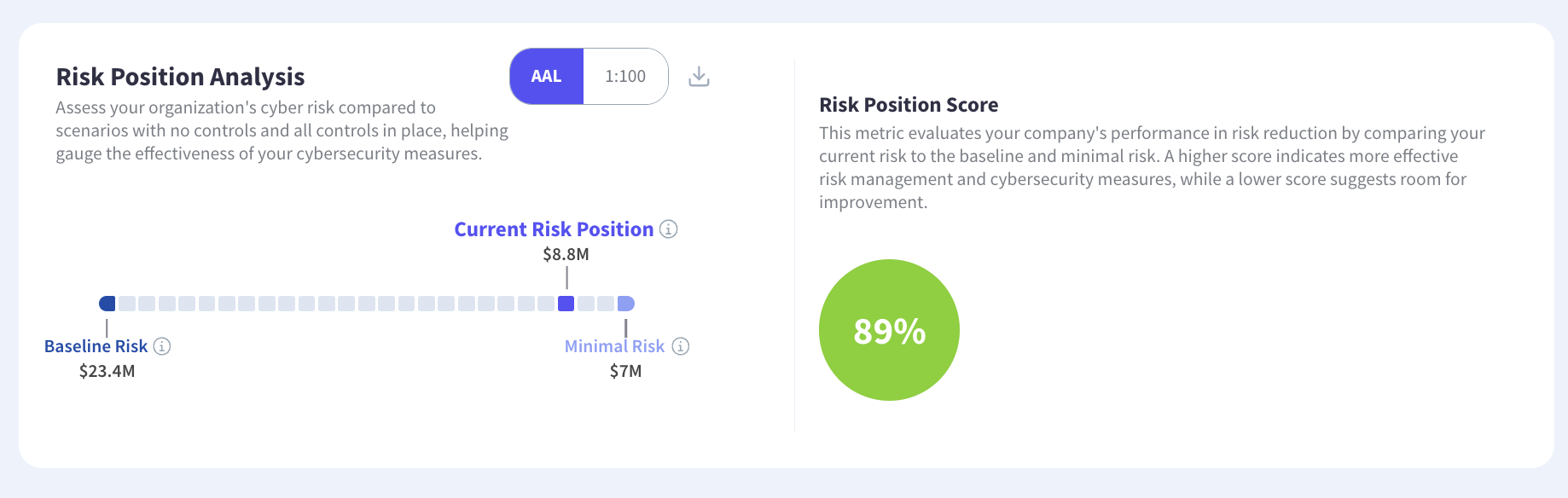
Where a baseline with no controls sits far above current exposure and the fully-controlled floor sits just below it, the program has already captured most of what controls can remove. The remaining exposure is structural rather than addressable, which is a different conversation from asking for budget. Programs building a data-driven budget case on the gross figure rather than the remaining one tend to be challenged on it.
Where the floor sits close to current exposure, the useful response moves away from controls. Risk transfer covers what remediation cannot reach, and continuity investment reduces the duration driving severity. Both are defensible once the model shows the limit, and neither is defensible as a reaction to a single gross figure.
4. Aggregate Exposure Is Less Than the Sum of the Scenarios
Add the expected losses of twenty scenarios and the total exceeds the modeled portfolio figure. People assume an error. It is diversification.
Scenarios do not all occur in the same year, and a model simulating whole years accounts for that rather than stacking independent averages. The same logic works in reverse at the tail, where correlated events push aggregate severity above what independent scenarios would suggest, because one shared dependency failing affects several scenarios simultaneously. Aggregation through a common supplier is the documented version of that mechanism.
For reporting, this means never presenting a slide that sums scenario figures into a total. Someone in the room will add the column, arrive at a different number, and spend the remaining time asking which is right. Reporting scenarios individually and the portfolio separately, with a line explaining why they differ, closes the question before it opens.
5. Third-Party Risk Is Small in the Average and Large in the Tail
Vendor exposure typically contributes a modest share of expected annual loss and a considerably larger share of the extreme figure. Programs reasoning about suppliers through averages therefore underweight them systematically.
The mechanism is the same correlation that makes concentration dangerous. A shared provider failing affects everything depending on it at once, which is a tail event by construction rather than an attritional one. Assessing suppliers individually cannot see it, and concentration examined across the portfolio is what surfaces the difference.
The consequence for vendor programs is that criticality tiering built on how much you depend on a supplier misses how much loss that dependence carries. Modeling the shared dependency rather than the individual contract is the change, and it usually reorders the list.
6. Interruption Outweighs Data Loss in Most Portfolios
Break modeled loss down by business impact rather than by attack type and business interruption generally leads, ahead of data theft and privacy exposure.
Security programs organized primarily around confidentiality therefore mis-weight their own exposure, since most modeled loss arrives through things not working rather than information leaving. The composition also changes with severity, so remediation and settlement costs displace interruption at extreme loss levels. Ranking exposure by attack vector and by impact type answers two different questions and both belong in a report.
Budget allocation follows from the second. A portfolio where interruption dominates argues for recovery capability, redundancy and tested restoration alongside prevention, and those compete for the same money. Programs that never break loss down by impact type have no basis for making that trade.
7. The Number Moving Is Not Always Risk Moving
Exposure that falls after a model update is not exposure that fell because the environment improved, and conflating the two costs a program its credibility exactly once.
Recording the model version alongside every figure lets a reviewer distinguish a genuine change from a methodology change without asking. It also protects whoever presents the number when it improves for uninteresting reasons, which happens more often than anyone expects. Tracking progress across periods only works when the periods are comparable.
Disclosure is straightforward once it is habitual. State the model version and assessment date beside each figure, and where a methodology change moved the number, report the old and new calculations for one period so a reader sees the effect separately from any real movement. Doing that once builds more credibility than a year of unexplained improvement.
Reading the Output Correctly Is Half the Value
Each of these seven produces a wrong decision when misread. A median treated as a forecast overstates precision. A high figure treated as a security failure targets the wrong team. A gross exposure figure treated as addressable oversells a business case. Correlation ignored understates the tail and overstates the average. Getting the reading right costs nothing and changes what the model is worth. Kovrr's cyber risk quantification produces all of these views from one model, and the quantification FAQ covers the mechanics behind them.
To see what these seven look like against your own environment rather than in the abstract, book a demo with our cyber risk experts.

Quantifying Cyber Risk FAQs
Speak to an ExpertIs an expected annual loss figure a prediction?

Why does a business unit with better security show higher exposure?
Can controls remove most of the modeled exposure?
Why is aggregate exposure less than the sum of individual scenarios?
Why does third-party risk look small in the numbers?
How do you tell a real change from a model change?