Blog Post
An AI Risk Figure That Updates Without a Reassessment
September 27, 2026
An exposure figure produced from an assessment is accurate on the day it is signed and decays from then on. The obvious remedy is to anchor it to telemetry so it moves when the environment moves.
Only part of it can be anchored that way. Roughly half the inputs to a loss model are observable and the other half are not, and a figure that updates on half its inputs while presenting as a total is a worse instrument than one that declares a date.
Which Inputs Can Update Automatically?
The frequency and reach side, which is most of what observation is good for.
How many agents are running, what each can reach, which identities they act under, how many tool calls occurred, what data categories were touched, how often a policy refused something, and how far activity sits from its own baseline. All of that is countable continuously and none of it requires anybody's opinion.
Which Term Do Those Feed?
The likelihood side and the exposed population, rather than the cost of anything. Telemetry establishes how often a thing happens and how much surface it could reach, and it is silent on what the consequence would be worth. An AI data fabric widens the first and does nothing for the second.
Why Can't Magnitude Be Observed?
Because the inputs live in other functions and change on their own schedule, which is the structural reason rather than a tooling shortfall.
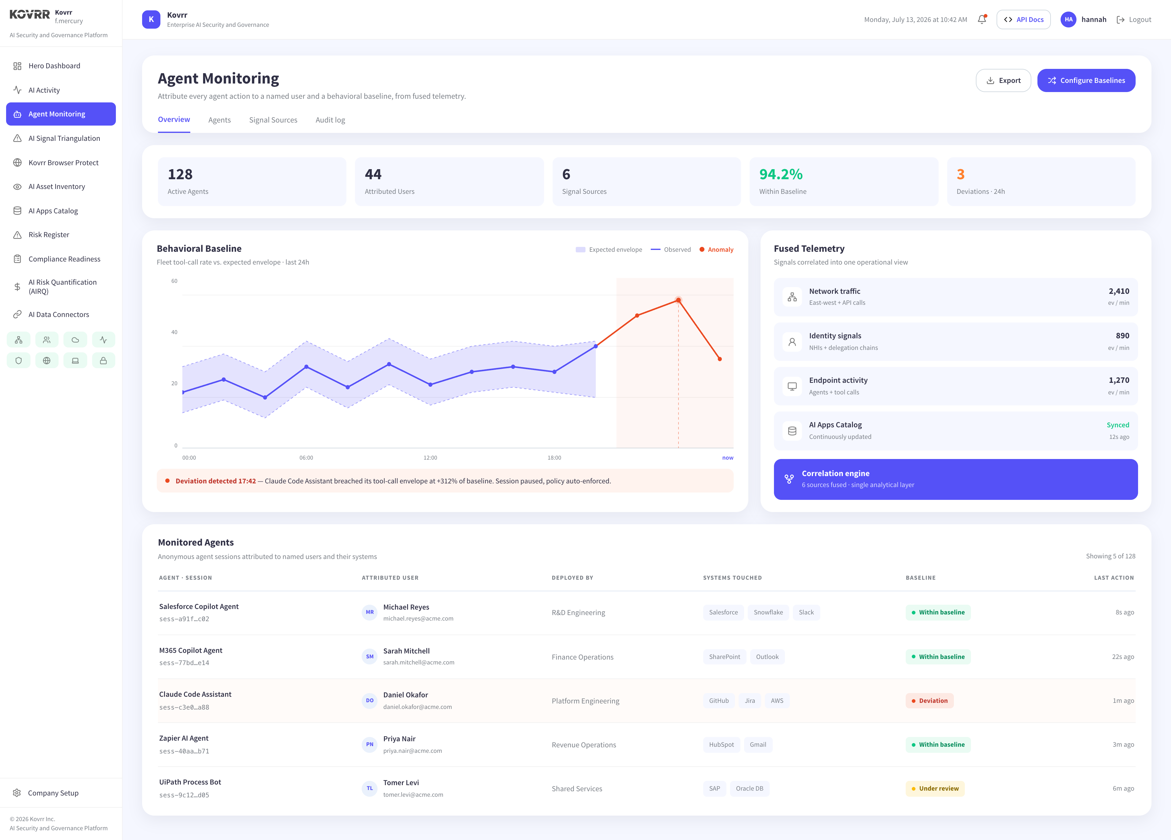
What a day of disruption costs comes from finance. What a regulatory finding would cost comes from counsel. What a customer relationship is worth comes from commercial. Contract terms, asset values and penalty exposure all sit outside the systems that emit telemetry, and they move when a contract is renegotiated rather than when an agent runs.
Which Sets the Right Cadence for Them
Quarterly or on a triggering event rather than continuously. A magnitude input that has not changed does not need refreshing, and one that has changed did so because somebody signed something. Watching for that is a different activity from watching a stream.
What Is the Third Category?
Inputs that are observable and should not auto-update, which the usual two-bucket split misses entirely.
Control effectiveness is measurable from telemetry. Coverage percentages, refusal counts and enforcement events are all countable. Feeding them straight into a figure produces a specific failure, because a control that stops firing looks identical to a control that is no longer needed.
Why Does That Matter?
A policy layer refusing forty actions a month and then refusing none has either succeeded in changing behavior or broken. The first improves exposure and the second worsens it, and the number is the same. Letting that input move the figure unattended produces an improvement on the dashboard at the moment the control failed, which verifying a control continuously has to account for.
Why Is a Half-Updating Figure Worse?
Because movement becomes uninterpretable, and this is the argument for being deliberate rather than maximal about what automates.
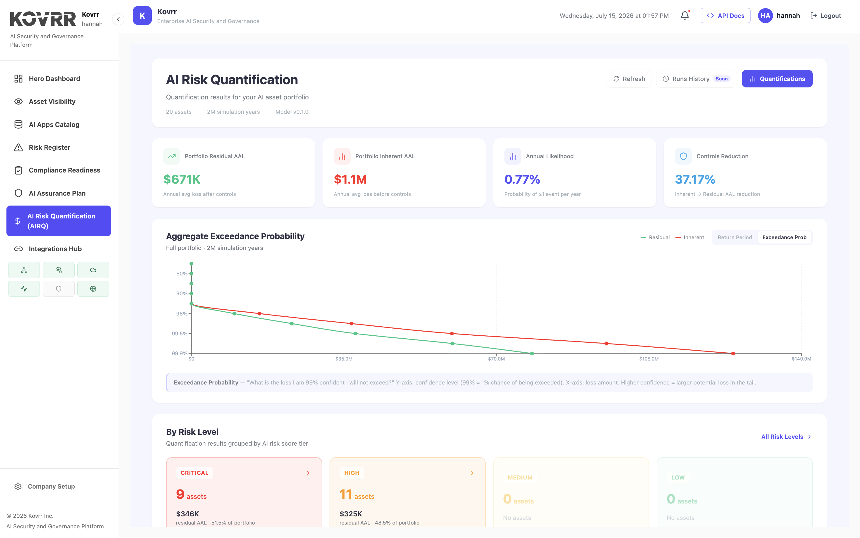
Where frequency updates hourly and magnitude is fixed from a stale review, the figure moves for exactly one reason. A reader watching it rise concludes that exposure grew when what grew was activity volume. The output has become a proxy for one input while presenting as a total, and nothing on the screen says so.
What Does a Static Figure Do Better?
It declares its date. A figure marked as of a quarter ago is understood to be a snapshot, and a reader discounts it accordingly. A continuously moving figure invites the assumption that everything behind it is current, which is the assumption that causes the misreading.
What Should Be Instrumented?
Four things, and each has to arrive with an identifier that survives.
- The agent and system inventory: What exists, attributed to an owner, so appearance and disappearance both register.
- The action surface per agent: What each can reach, since reach bounds the exposed population.
- Activity against a baseline: Volume relative to the agent's own envelope rather than an absolute count.
Data category reach completes it, meaning which classifications were touched rather than what the content was. All four are observable without capturing content, and an AI Interaction Data Fabric is what joins them to one identity so the figure has a subject.
How Should the Output Be Presented?
With a vintage per input rather than one date on the figure, which is a reporting change rather than a modeling one.
The frequency inputs carry today's date. The magnitude inputs carry the date of the last business review. The control inputs carry the date somebody last confirmed the interpretation. Showing three dates is less tidy and considerably more defensible, because a reader can see which half of the figure is current.
Which Also Answers the Audit Question
An examiner asking how a figure was reached wants the inputs and their provenance. A single timestamp on a moving number cannot answer it, and a per-input vintage can, which records that survive an audit requires in a different setting.
What Happens When an Input Stops Arriving?
The figure keeps producing a number, which is the failure mode continuous updating introduces and a static figure cannot have.
A connector breaks, a log source changes format, an agent moves to a platform nothing observes. The model still runs and still returns a value, computed over whatever arrived. Missing frequency data reads as reduced activity, so exposure falls, and the fall is indistinguishable from a genuine improvement.
What Prevents It?
Treating source liveness as an input in its own right. A count of sources expected against sources reporting, checked at every run, turns a silent omission into a stated condition. A figure produced from five of six sources should say so rather than presenting as complete, and establishing what each source is authoritative for is the prior step.
Which Is a Coverage Figure Again
The same problem appears wherever a control reports on itself. A model computing exposure from telemetry cannot tell you what the telemetry missed, so the denominator has to come from somewhere else, meaning an inventory of what should be reporting rather than a list of what did. Measuring what a control covers uses the same reasoning.
What Decision Is the Figure For?
The question that should set the cadence, and it usually gets decided by data availability instead.
A budget decision needs a stable figure with a defensible basis, taken once and defended for a year. An operational decision needs to know that something moved this week. Those are different consumers wanting different things, and a single continuously updating number serves the second while being presented to the first. AI risk quantification, or AIRQ, that separates the two produces a quarterly figure for funding and a moving one for operations, from the same inputs.
Automate the Frequency, Date the Rest
The observable half of a loss model is frequency and reach, since counts of agents, action surfaces, identities, volumes and baseline deviations are all countable without anybody's opinion. Magnitude is not observable, because asset values, contract terms and penalty exposure live in finance, commercial and legal, and they move when something is signed rather than when an agent runs. A third category exists that the usual split misses, being inputs that are observable and should not auto-update, of which control effectiveness is the sharpest example, since a control that stopped firing looks identical to one no longer needed. A figure updating on half its inputs while presenting as a total also makes its own movement uninterpretable. Kovrr's AIRQ carries a vintage per input rather than one date on the output.
To see which inputs to your exposure figure update from observed activity and which do not, book a demo mapped to your own estate.
Continuous AIRQ FAQs
Speak to an ExpertCan an AI risk figure update automatically from telemetry?

Why can't loss magnitude be updated from telemetry?
Should control effectiveness auto-update a risk figure?
Is a continuously updating risk figure better than an annual one?
How should a continuously updating exposure figure be presented?
What should be instrumented for continuous AI risk quantification?