
Blog Post
One Loss Distribution, Two Very Different Charts
August 23, 2026
A cyber loss model produces one distribution. How that distribution gets drawn changes what a reader can see in it, and the conventional projection hides the part most decisions depend on.
The two views below contain identical data. One of them is close to unreadable for anything except the extreme tail, and the difference is worth understanding before the next time somebody asks what the number means.
The Exceedance View Compresses the Middle
Plot loss on the horizontal axis and probability on the vertical, and the curve answers a specific question. What is the chance of losing this amount or more in a year.
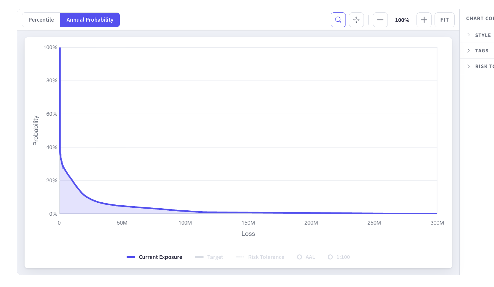
Read the shape rather than the axis labels. The curve drops almost vertically at the left, then runs nearly flat across the rest of a chart that extends to three hundred million. Almost the entire horizontal span describes outcomes with probabilities too small to distinguish, while everything from the median up to the severe cases occupies a sliver at the left edge.
The Compressed Band Holds the Decisions
Retention setting, budget cases, appetite thresholds and control prioritization all concern losses an organization might plausibly experience, not the once-in-a-thousand-year case. Those live in the compressed region. A reader can extract the one-in-a-hundred figure from this projection and very little else, which is why reading the exceedance curve takes explaining.
The Percentile View Reads the Same Data Differently
Transpose the axes and rescale both. Percentile runs along the horizontal with the spacing stretched toward the tail, loss runs up the vertical on a logarithmic scale, and the question becomes what loss the organization can be a given percentage confident of not exceeding.
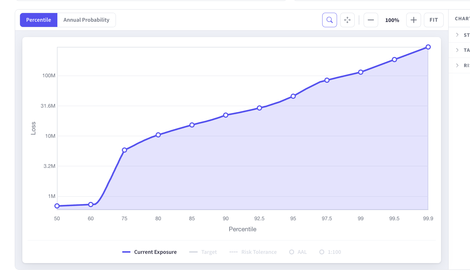
The same distribution now has a shape. Below roughly the sixtieth percentile, modeled loss sits under a million and barely moves. Between the sixtieth and seventy-fifth it rises by close to an order of magnitude. Above that it climbs steadily through the higher percentiles.
The Step Is the Most Useful Feature on the Chart
The rise marks the boundary between years where cyber loss is an operating expense and years where it becomes a financial event. It is arguably the single most decision-relevant feature of the distribution, and on the exceedance projection it is invisible, buried inside the near-vertical section at the left edge.
Which View Suits Which Question
Neither projection is correct in general. Each answers questions the other answers poorly, which is why both remain available rather than one replacing the other.
- Percentile: Where does loss become material, how much of the range is routine, and what figure covers most years.
- Exceedance: What is the return period for a given loss, which is the language insurance and capital conversations already use.
- Both: Whether a stated appetite threshold sits in the routine part of the distribution or the severe part.
Analysis in our own platform now opens on the percentile view for that reason, with exceedance a toggle away, since most working questions concern where loss becomes material rather than the shape of the extreme tail. Return-period framing remains the right language for board and insurance conversations, and switching between the two costs nothing.
Reading the Percentile View Without Overreading It
Three cautions apply, and the first catches people immediately.
Percentiles Are Not Years
The ninetieth percentile is not what happens in nine years out of ten. It is the level below which ninety percent of simulated years fall, which is a statement about the distribution rather than a schedule. Two consecutive years can both land above it.
The Log Scale Flattens the Tail Visually
Logarithmic spacing on the vertical axis is what makes the lower percentiles legible at all, and it makes the extreme end look gentler than it is. A modest-looking rise near the top of the chart can be tens of millions. Reading values rather than slopes avoids the error.
The Curve Is Only as Good as the Model Version
A shape that changes between assessments may reflect a changed environment or a changed methodology, and the two are indistinguishable without the version recorded alongside. Model stability determines how much of any movement is signal.
What to Do With the Step
Once the transition point is visible it supports several decisions that were previously argued qualitatively.
Retention can be set relative to it rather than to a peer benchmark, since the sensible attachment point sits near where routine loss ends. An appetite threshold placed below the step is a statement that the organization will not tolerate a normal year, which is usually not what anyone intended, and a threshold that can be breached has to sit somewhere defensible. Control investment aimed at reducing frequency moves the lower part of the curve while investment in resilience and recovery flattens the rise, so the shape indicates which lever applies. Setting limits from the distribution rather than from a benchmark is what testing whether coverage is correctly sized depends on.
Report the Level Alongside the Slope
A board briefing carrying one number invites the question of whether it is good. The same briefing showing where routine loss ends, where it becomes severe, and how both moved since the previous assessment answers a question directors can act on. Two figures and a direction beat a single headline.
One Distribution, Two Readings
The exceedance curve and the percentile curve are the same model drawn differently, and the projection determines what a reader can see. Probability against loss compresses everything except the extreme tail into the left edge of the chart. Loss against percentile on a logarithmic scale makes the whole range legible, including the transition from routine to material that most decisions turn on. Kovrr's cyber risk quantification provides both, because the questions asked of a loss model are not all the same question.
To see where routine loss ends and material loss begins in your own environment, book a demo with our cyber risk experts.

Loss Distribution FAQs
Speak to an ExpertWhat is the difference between the exceedance and percentile views?

Why does the exceedance curve hide most of the distribution?
What does the step in the percentile curve mean?
Does the percentile view replace the exceedance curve?
How should the percentile view be read carefully?
What decisions does the transition point support?