
Blog Post
The Cyber Risk Inputs That Move the Answer Most
October 2, 2026
A cyber loss model has dozens of inputs and every one of them can be argued about. Record counts, downtime costs, control effectiveness, secondary loss factors, event likelihoods.
A few of them determine the answer and the rest barely move it. Knowing which is which tells you where estimation effort belongs, and more usefully which disagreements about the model are not worth having.
How Is Sensitivity Measured?
One input is varied across its plausible range while the others hold still, and the resulting swings are ranked.
Each input is moved between a realistic low and high, frequently its fifth and ninety-fifth percentile, and the change in output is recorded. Sorted largest to smallest the bars form the shape the technique is named after, with the dominant inputs at the top.
What Does the Ranking Tell You to Do?
At the top, collect better data, since uncertainty there drives the error in the whole model. At the bottom, accept a rough estimate or a constant and stop refining, because large changes to those inputs barely move the result.
Which Inputs Dominate a Cyber Model?
It depends which output you are reading, which is the finding that reorders most arguments about these models.
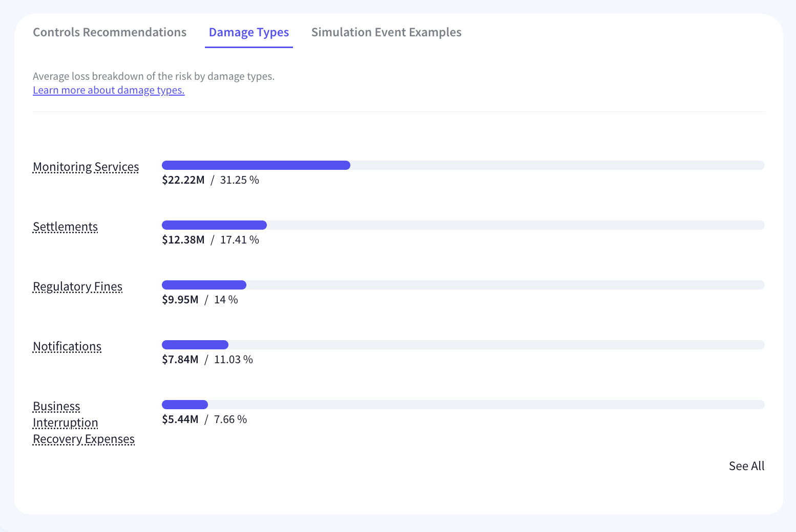
An average annual figure is roughly frequency multiplied by mean magnitude, so it responds about equally to both. A tail figure is driven by the upper end of the magnitude distribution and by its shape, and frequency moves it comparatively little. Doubling the number of expected events moves the whole curve modestly, while doubling the magnitude tail moves a one-in-hundred figure close to proportionally.
The Argument Is Frequently Misplaced
An organization disputing frequency estimates while reporting a tail figure to its board is arguing about an input that does not decide the number being reported. Establishing which output the decision rests on comes before establishing which input to refine, and reading a distribution at more than one point is what makes the difference visible.
What Is the Most Sensitive Input?
Usually the distribution shape, and it is the one nobody has an opinion about.
Whether magnitude is modeled as lognormal or with a heavier tail, and how much dispersion is assumed, moves an extreme percentile more than any single point estimate. It is a modeling choice rather than a business fact, so no stakeholder arrives with a view on it and it passes unexamined while the record count gets debated for an hour.
What Should Be Asked About It?
Which family was chosen, on what basis, and what the tail figure would be under the plausible alternative. A model whose owner can answer that has made a defensible choice, and one who cannot has inherited a default, which auditing a model somebody else built treats as the first question rather than a technical aside.
Which Inputs Are Worth Improving?
Three groups, and the useful axis is cost of improvement against sensitivity rather than sensitivity alone.
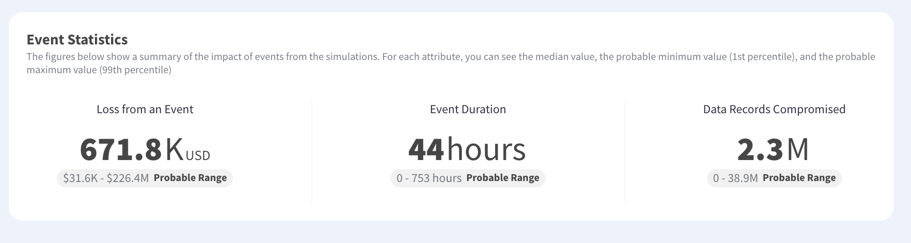
High sensitivity and cheap to improve is where effort belongs, covering record counts, asset values, contract terms and penalty exposure. Those sit in finance, legal and commercial and are knowable by asking. High sensitivity and expensive covers distribution shape and tail behavior, which needs reference data rather than an internal answer.
The Third Group
Low sensitivity, whatever it costs. Precise control effectiveness percentages and secondary loss factors for minor categories belong here, and refining them produces a more elaborate model with the same output. Perfection in the wrong input buys nothing.
Which Arguments Does This End?
The ones about inputs that do not matter, which is a large proportion of them.
Where a stakeholder disputes a value, substituting their preferred figure and showing the output is unchanged settles the question with arithmetic rather than authority. The disagreement dissolves because it turned out not to be about anything, and the conversation moves to an input that does decide the answer.
Which Also Works in Reverse
Where a disputed input is highly sensitive, the disagreement is real and worth resolving properly. Sensitivity analysis tells you which arguments to have as much as which to drop, and a reviewer who can evaluate the work is who should be having the second kind.
What Does the Technique Miss?
Interaction, because varying one input at a time assumes the others hold still.
Where inputs are correlated the ranking understates. A larger organization has more events and larger losses, so frequency and magnitude move together, and a one-at-a-time analysis attributes to each separately what they produce jointly. The tornado is a first pass rather than a final answer.
What Addresses It?
Varying correlated inputs together and comparing the joint swing against the sum of the individual ones. Where the joint effect is materially larger, the pair should be treated as one input for estimation purposes, and summing independent scenarios is the same error at scenario level rather than input level.
Does Sensitivity Change What to Report?
It should, because a figure whose dominant input is a modeling assumption deserves a different presentation from one driven by a countable fact.
An exposure figure resting mainly on record counts and contract terms is grounded in things somebody can verify. One resting mainly on an assumed tail shape is grounded in a choice, and presenting both with the same confidence misrepresents the second. Naming the dominant input alongside the figure is a one-line addition that changes how it is read.
What Does That Look Like in a Board Pack?
A sentence stating which input the number is most sensitive to and what it would be under the alternative. Directors are used to that convention from financial reporting, where a valuation sensitive to a discount rate assumption is presented with the range, and what belongs in a board report has room for one more line.
Which Also Protects the Figure
A number presented with its dominant assumption stated survives challenge better than one presented as a fact. Where the assumption is later disputed, the disclosure was made rather than discovered, and the disagreement is about the assumption rather than about candor.
What Should Be Established?
Three things, and the first takes an afternoon with an existing model.
Which five inputs move the output most, for the specific output your decisions rest on rather than for the model generally. Which of those five are cheap to improve, since that is where the next estimation effort belongs. Then which distribution family and dispersion were chosen and on what basis, because it is usually the top of the list and rarely the subject of a decision. Cyber risk quantification built on simulation rather than a point calculation is what makes the analysis available at all.
Refine the Top, Freeze the Bottom
Varying each input across its plausible range and ranking the swings tells you where estimation effort belongs, and the dominant inputs differ depending on which output the decision rests on. An average responds about equally to frequency and mean magnitude, while a tail figure is driven by the upper end of the magnitude distribution and its shape, so disputing frequency while reporting a one-in-hundred figure is arguing about the wrong input. The distribution shape is usually the most sensitive input and the least examined, because it is a modeling choice rather than a business fact. The technique also tells you which disagreements to drop, since substituting a disputed value and showing no change ends an argument with arithmetic. Kovrr's cyber risk quantification exposes which drivers move the figure.
To see which drivers move your exposure figure most, book a demo with our risk experts.

Model Sensitivity FAQs
Speak to an ExpertWhat is a tornado diagram in risk analysis?

Does frequency or severity matter more in a cyber loss model?
What is the most sensitive input in a cyber loss model?
Should you refine a low-sensitivity input?
How does sensitivity analysis settle arguments about a model?
What are the limits of one-at-a-time sensitivity analysis?