
Blog Post
What a Cyber Risk Number Cannot Tell You
September 3, 2026
Arguments for quantifying cyber risk are abundant and mostly sound. What gets published far less often is a plain account of what a modeled figure does not tell you, which is unfortunate, because stating the limits is more persuasive to a skeptical audience than another argument for the method.
We build these models. What follows is what they cannot do, written plainly, followed by what remains useful once those limits are accepted.
Can a Model Tell You What Will Happen This Year?
No. A distribution describes a population of possible years, and you get one of them.
An organization can sit below its modeled expected loss for a decade and then exceed its one-in-hundred figure twice in eighteen months. Neither outcome contradicts the model, because a distribution makes no claim about any individual draw from it. Anyone presenting a quantified figure as a forecast for the coming year has misdescribed what it is.
Does That Make the Figure Unfalsifiable?
In the short run, largely yes, and this is the deepest limitation of the method. Predict four million and lose nothing, and the model is not shown to be wrong. Lose forty million and it is not shown to be wrong either. Validation against outcomes requires many organizations over many years rather than one organization over one, so an individual customer cannot verify their own figure from experience.
Does the Model Know Whether Your Controls Work?
It does not. Control state is an input to the model rather than a finding produced by it.
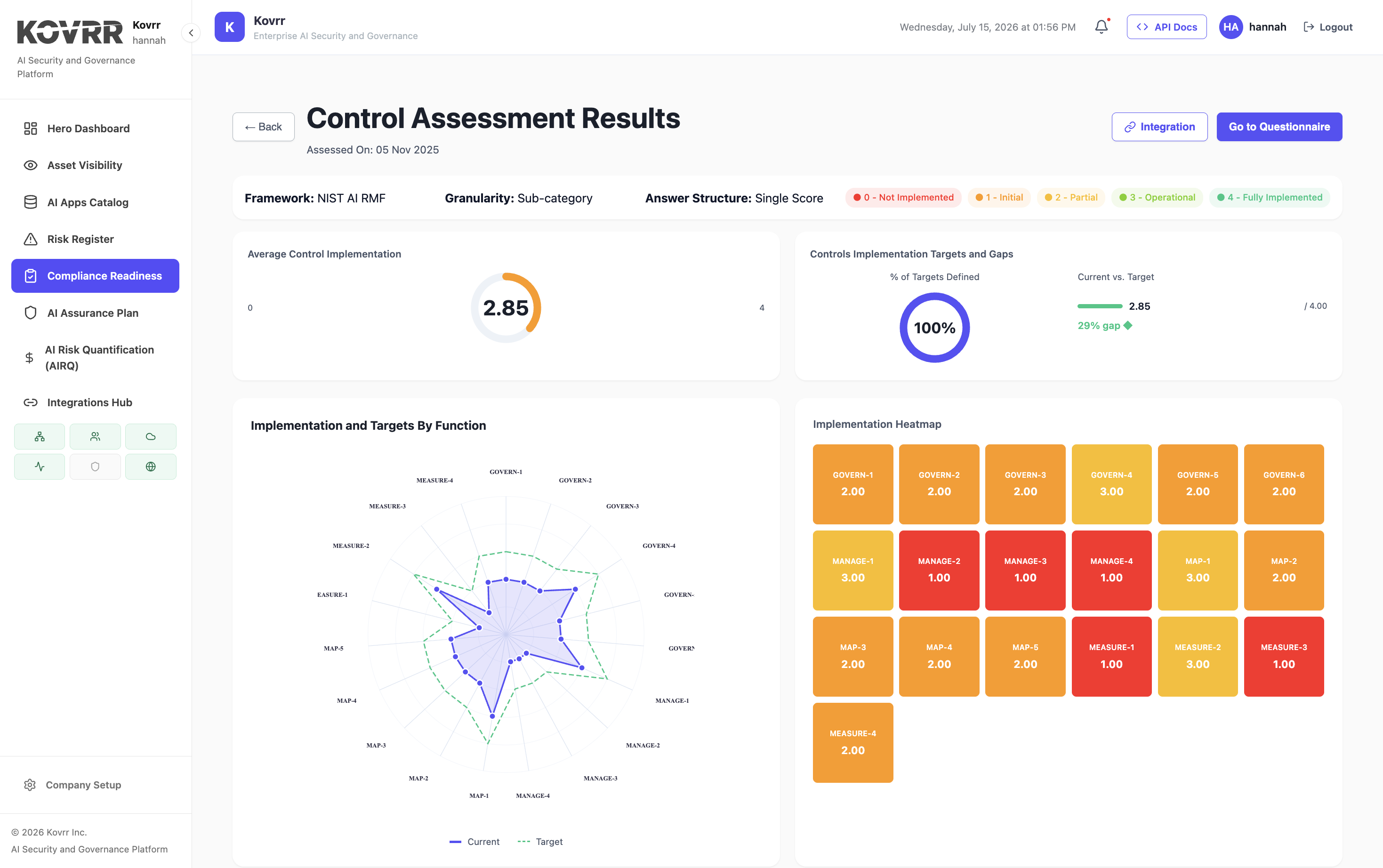
Whatever the assessment says about a control, the model uses it. A control that is configured correctly and bypassed in practice reads as present. A control implemented on eighty percent of the estate and recorded as implemented reads as complete. The output inherits the accuracy of the control data and adds no verification of its own, which is why continuously verified control state changes the quality of the figure more than any modeling refinement.
Where Does the Underlying Data Mislead?
In a specific and known direction. Loss data is assembled largely from disclosed events, and disclosure is not random.
Large events are disclosed because regulation requires it or because they are impossible to conceal. Moderate events frequently are not, since they fall below reporting thresholds and organizations have no reason to publicize them. The resulting population is therefore rich in catastrophes and thin in the middle, which tends to make models better calibrated on the tail than on the body of the distribution.
What Does That Mean for the Figure You Get?
The extreme figures rest on better evidence than the routine ones, which is the reverse of what most people assume. It also means expected annual loss, which is dominated by the frequent smaller events, is estimated from the weakest part of the data. Anyone treating the average as solid and the tail as speculative has it backwards.
Can a Model Account for an Adversary Who Adapts?
Only partially, and this is a genuine structural weakness rather than a calibration problem.
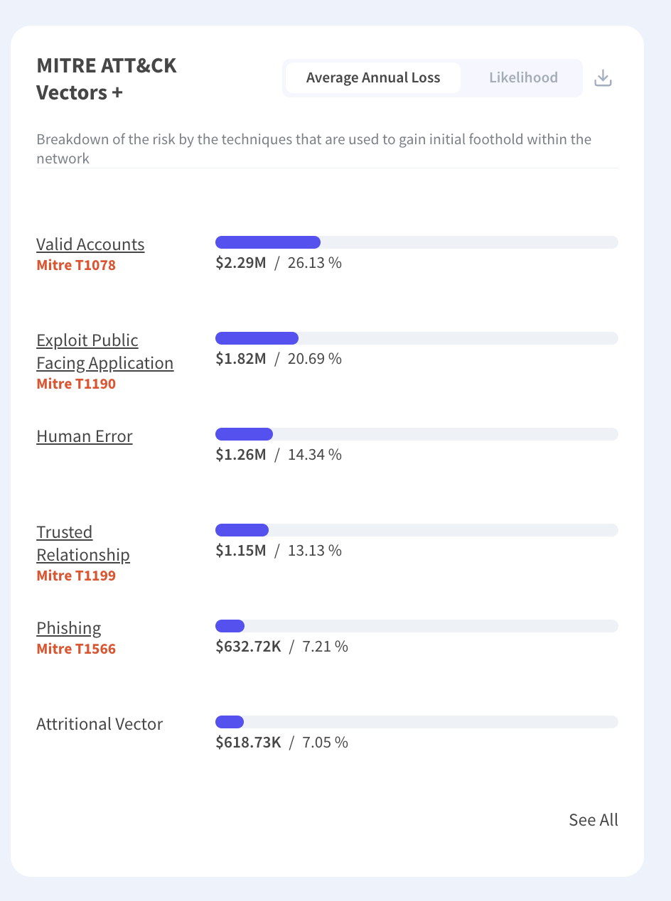
Loss models treat frequency as a property of the environment, estimated from what has happened. An adversary is not a weather system. Closing one path moves the attacker to another rather than removing them, so improving a control can reduce the modeled figure by more than it reduces real exposure.
How Much Should That Discount Your Results?
Enough to treat single-control improvements skeptically and not enough to abandon the method. Controls that raise cost across many paths, such as identity and segmentation, are more robust to substitution than controls that close one specific route. Reading a projected reduction as an upper bound rather than an expectation handles most of it.
What Cannot Be Priced at All?
Three categories, and assigning them a number is a modeling convenience rather than a measurement.
- Safety and Physical Harm: Where an event could injure people, the figure attached is a legal or actuarial convention rather than a valuation.
- Individual Rights: Harm to people whose data was exposed is not the same object as the organization's cost of the exposure.
- Trust: Erosion of customer or public confidence has effects that appear over years and resist attribution to any single event.
Those categories still belong in the analysis, named and unpriced, rather than being silently omitted because they resist measurement. A model reporting only what it can price and not stating what it excluded produces a figure that reads as complete and is not.
Does the Model Know What You Own?
Only what it was told. Asset scope is supplied rather than discovered, and an incomplete inventory produces a figure that is precise about the wrong estate.
Systems nobody registered are absent from the calculation entirely, which understates exposure silently rather than producing an obvious error. Shadow infrastructure, unmanaged software as a service, an acquired business still running its own environment, and anything a department bought directly all fall outside a model built from the official inventory. The output looks identical whether the inventory covers ninety percent of the estate or sixty.
How Would You Know the Scope Was Wrong?
Not from the model, since it has no way to represent what it was never given. The check has to come from outside, by comparing the asset list against network observation, expenditure records or identity logs, which building an inventory from telemetry addresses for the AI side of an estate. Any of those routinely surfaces systems the register lacks, and a program presenting a quantified figure without having run that comparison is quoting a number whose denominator is unverified.
Does That Affect Some Figures More Than Others?
It affects severity most, since a missing system removes whatever it would have contributed to loss. It also distorts prioritization, because remediation gets sequenced across the systems the model knows about while the unmodeled ones receive no attention at all, which is a worse outcome than an inaccurate ranking.
Which Inputs Are Assumptions Rather Than Measurements?
More than most presentations acknowledge, and correlation is the plainest case.
How strongly scenarios move together determines the extreme figure substantially, and no single organization experiences enough significant events to estimate it from its own history. The number used is therefore assumed, informed by structure rather than observed, and bounding the effect rather than estimating it is a more honest treatment than quoting a coefficient.
What Else Sits in That Category?
Business interruption duration, which depends on a recovery capability rarely tested at the scale the scenario assumes. Third-party dependency mapping, which is incomplete past the first tier for almost everyone. The frequency of event classes with few observed instances completes it, where the estimate rests on judgment presented in the same format as figures with far stronger support.
What Is a Quantified Figure Good For?
Comparison rather than prediction, which is a narrower claim than the marketing usually makes and a defensible one.
It ranks consistently, so two exposures assessed the same way can be ordered and remediation sequenced. It makes assumptions explicit, so a reviewer can contest an input rather than an opinion. It converts to a unit that composes with other enterprise risks, which no severity rating does. It also produces a series, so movement between periods is visible where methodology was held constant.
None of Which Requires the Number to Be Right
That is the point worth internalizing. Ranking, comparison and trend all survive a systematic bias in the absolute figure, provided the bias applies consistently. A model that is wrong by a constant factor still orders correctly and still shows improvement, which is most of what a program needs, and statistical significance determines how much movement counts as real.
How Should a Number Be Presented to a Skeptic?
Lead with the limits, which sounds counterproductive and is not. An auditor or a doubtful director is testing whether the presenter understands the method, and volunteering its weaknesses answers that faster than defending its strengths.
Four things belong in the presentation. A range rather than a point. The assumption doing the most work, named. What would have to be true for the figure to be substantially wrong. Finally, what the number is not being used to claim, which prevents it being read as a forecast. Board reporting that includes those four is harder to dismiss than a confident single figure.
Is a Model Better Than the Alternative?
The comparison that matters is rarely the one made. The choice is not between a quantified figure and certainty, it is between a quantified figure and whatever the organization was doing instead.
The alternative is usually a severity rating produced by the same people from the same information, carrying every limitation described above plus two more. It cannot be aggregated, since high plus high is not a quantity. It also hides its assumptions inside a judgment, so a reviewer cannot contest an input because no inputs were stated.
So the Limits Are Not an Argument Against the Method
They are an argument against overclaiming for it. Every criticism in this piece applies with equal or greater force to a colored matrix, which is why the honest comparison favors quantification while the honest presentation of quantification includes its weaknesses. The case against the matrix rests on the same reasoning applied in the other direction.
Say What It Cannot Do
A cyber loss model does not predict your year, cannot verify the control data it consumes, rests on disclosure-biased evidence that is stronger on catastrophes than on routine events, and treats an adaptive adversary as though it were weather. Correlation, recovery duration and dependency structure are assumptions wearing the same notation as measurements. What survives all of that is comparison, sequencing and trend, none of which requires the absolute figure to be correct. Kovrr's cyber risk quantification reports the model version, the peer comparison and a robustness indicator alongside each figure, because the caveats are part of the output rather than a disclaimer beneath it.
To see modeled exposure with its assumptions and supporting data visible, book a demo with our cyber risk experts.

Quantification Limits FAQs
Speak to an ExpertCan a quantified figure predict what will happen this year?

Does the model verify that controls work?
How does the underlying loss data mislead?
Can a model account for adversaries who adapt?
What cannot be priced at all?
What is a quantified figure good for?